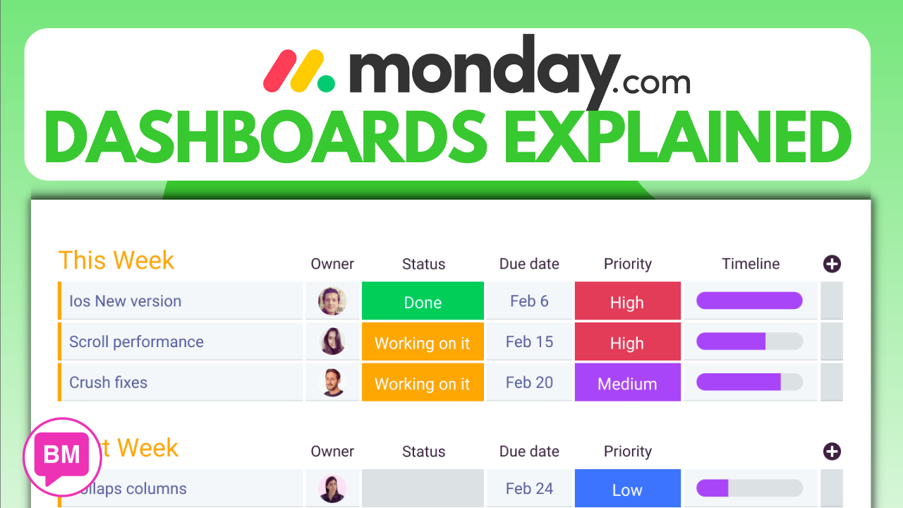
Monday.com DASHBOARDS Explained | Monday.com Tutorial For BEGINNERS – You will discover the power of Monday.com Dashboards. These Dashboards offer a comprehensive view of both Board and standalone views, making it easier for users to access and analyze data from multiple boards. Whether you need to create Gantt charts, track time and sales activity, or improve business processes, Monday Dashboards have got you covered. This tutorial walks beginners through the process of using Dashboards effectively, allowing them to better organize their work and share insights with their team. If you’re curious to learn more about Monday.com Dashboards and how they can enhance your workflow, read this post or watch the video.
Getting Started
What are Monday.com Dashboards?
Monday.com Dashboards are a valuable tool that allows you to visualize and analyze your work data in a simple and intuitive way. By leveraging the power of data visualization, Monday.com Dashboards help you monitor and manage your projects, tasks, and overall business performance more effectively.
Benefits of using Monday.com Dashboards
There are numerous benefits to using Monday.com Dashboards in your workflow. Firstly, they provide a consolidated and comprehensive view of your data, allowing you to gain insights and identify trends quickly. This can help you make data-driven decisions and prioritize tasks more efficiently.
Secondly, Monday.com Dashboards enable you to track key metrics and KPIs in real-time. With customizable widgets and charts, you can monitor the progress of your projects, measure team performance, and identify areas that require attention or improvement.
Furthermore, Monday.com Dashboards promote transparency and collaboration within your team. By sharing relevant dashboards with your colleagues, everyone can stay on the same page, track progress, and contribute to the overall success of the projects.
Lastly, Monday.com Dashboards are highly customizable, allowing you to tailor the visual representation of your data to suit your specific needs and preferences. Whether you prefer a high-level overview or a detailed breakdown, you have the flexibility to create and customize dashboards according to your requirements.
Creating and accessing Dashboards
Creating and accessing Monday.com Dashboards is incredibly simple. Once you have logged in to your Monday.com account, you can navigate to the Dashboards section from the main menu. From there, you can either create a new dashboard or access existing ones.
To create a new dashboard, click on the “New Dashboard” button. You can then choose a template to start with or create a dashboard from scratch. Give your dashboard a descriptive name and select the boards you want to include. You can customize the layout, add widgets, and configure the settings according to your preferences.
To access an existing dashboard, simply click on the dashboard name from the list of available dashboards. You can easily switch between dashboards and view the data that is relevant to your current focus.

Public vs Private Dashboards
With Monday.com Dashboards, you have the option to make your dashboards public or keep them private. Public dashboards are accessible to anyone within your organization, allowing for increased visibility and transparency. This can be useful when you want to share progress updates, metrics, or important project information with a wider audience.
On the other hand, private dashboards are only visible to the team members you choose to share them with. This allows for more control over who can access and interact with the data in the dashboard. Private dashboards are ideal for sensitive data or when you need to restrict access to specific individuals or teams.
It’s important to consider the nature of your data and the audience you are targeting when deciding between public and private dashboards. Monday.com provides the flexibility to choose the appropriate visibility settings to ensure your data remains secure and accessible to the right people.
Board Views
Understanding Board views
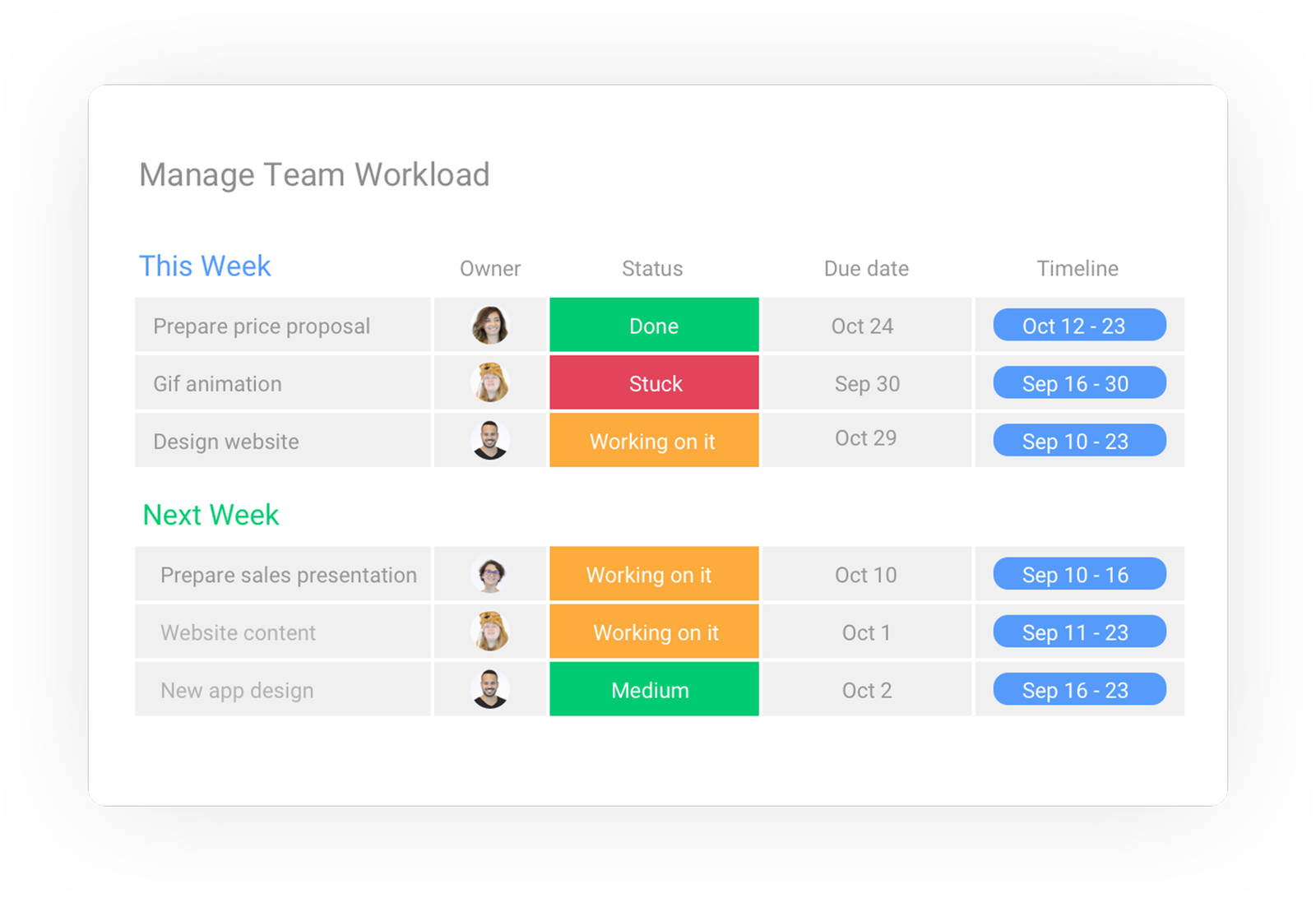
Board views in Monday.com allow you to visualize and interact with the data within a specific board. A board represents a project or a set of tasks, and board views provide different ways to organize and display the information.
The default view in Monday.com is the “Board View,” which resembles a Kanban board. It displays columns that represent different stages of your workflow, and each item or task is represented by a card that you can move across the columns.
In addition to the Board View, Monday.com offers other views such as “Table View,” “Timeline View,” and “Calendar View.” Each view has its own advantages and is designed to cater to different types of data and workflows. For example, the Timeline View provides a visual representation of tasks over time, while the Table View offers a more structured and organized way to view and edit data.
Viewing information in a specific Board
To view information within a specific board, you can simply click on the board name from the main menu. This will take you to the default Board View, where you can see the tasks and columns associated with the board.
From there, you can navigate to different views by clicking on the view icons displayed at the top of the board. This allows you to switch between views and explore the data in different formats.
Furthermore, you can apply filters and sorting options to narrow down the information displayed in the board views. This can help you focus on specific tasks, deadlines, or team members, making it easier to track progress and identify bottlenecks.
Customizing Board views
Customizing board views in Monday.com adds a layer of flexibility and adaptability to your workflow. You can tailor the views to match your preferences and requirements, ensuring that the data is presented in the most effective and meaningful way.
In each view, you can adjust the layout, reorder columns, and add or remove specific columns to display the information that is most relevant to you. For example, you can add a “Priority” column to indicate the urgency of tasks or a “Progress” column to track the status of each item.
Additionally, you can configure various settings and options within each view. This includes setting up automation rules, creating dependencies between tasks, and applying conditional formatting to highlight important information.
By customizing board views, you can optimize your workflow, improve visibility, and align the data presentation with your team’s specific needs and preferences.
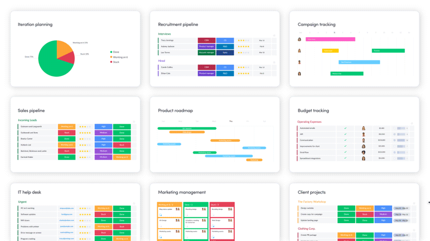
Standalone Dashboards
Overview of Standalone Dashboards
Standalone Dashboards in Monday.com provide a centralized and holistic view of your data across multiple boards. Unlike regular dashboards, which are associated with specific boards, standalone dashboards allow you to consolidate and analyze data from different projects or areas of your business.
Standalone dashboards are particularly useful when you need to gain insights into the bigger picture or analyze data that spans multiple teams or departments. Instead of switching between different boards and views, standalone dashboards provide a single location where you can monitor and track progress across different projects or areas of focus.
Viewing data from multiple Boards
To view data from multiple boards in a standalone dashboard, you can add the desired boards to the dashboard. This can be done by clicking on the “Add Boards” button within the standalone dashboard interface.
Once you have added the boards, you can choose how to display the data within the dashboard. Monday.com provides various visualization options, such as charts, tables, and graphs, allowing you to represent the data in a way that is most meaningful and informative.
By consolidating data from multiple boards, standalone dashboards enable you to identify patterns, trends, and correlations that may not be apparent when viewing individual boards separately. This holistic view can help you make informed decisions and allocate resources more effectively.
Importance of Standalone Dashboards for big picture analysis
Standalone dashboards play a crucial role in big picture analysis by providing a comprehensive overview of your organization’s performance. They allow you to examine the interdependencies and relationships between different projects, teams, and departments, facilitating a more holistic understanding of your business.
By visualizing data from multiple boards in a standalone dashboard, you can gain insights into the overall health of your organization. This includes identifying bottlenecks, resource allocation imbalances, and areas that require additional attention or improvement.
Standalone dashboards also facilitate strategic planning and decision-making. By analyzing data from various sources, you can identify opportunities, evaluate risks, and make data-driven decisions that align with your organization’s goals and objectives.
Overall, standalone dashboards serve as a powerful tool for executives, managers, and stakeholders to monitor and analyze the performance of their organization as a whole.
Utilizing Dashboards
Creating Gantt charts
Gantt charts are a popular and effective way to visualize project timelines, dependencies, and task progress. With Monday.com Dashboards, you can easily create interactive Gantt charts that provide a comprehensive overview of your project’s schedule.
To create a Gantt chart, you can add a Gantt chart widget to your dashboard and select the relevant boards and tasks you want to include. You can customize the chart by adjusting the timeline, defining dependencies, and assigning resources to tasks.
Gantt charts in Monday.com Dashboards allow you to track the progress of your projects in real-time, identify critical paths and bottlenecks, and make adjustments to ensure timely completion. They provide a visual representation of your project’s timeline and help you manage resources efficiently.
Tracking time and sales activity
Monday.com Dashboards offer powerful features for tracking time and sales activity. By utilizing widgets and integrations, you can monitor and analyze key metrics related to time tracking, sales performance, and revenue generation.
For time tracking, you can use the Time Tracking widget to record and visualize the time spent on specific tasks or projects. This allows you to analyze productivity, identify time-consuming activities, and optimize your workflow accordingly.
In terms of sales activity, Monday.com integrates with popular CRM and sales management tools, enabling you to sync your sales data and track key performance indicators. You can create widgets that display information such as deals won, revenue generated, and conversion rates, providing valuable insights into your sales pipeline and performance.
By leveraging the time tracking and sales activity features in Monday.com Dashboards, you can make data-driven decisions, identify areas for improvement, and optimize your team’s productivity and sales performance.
Organizing business processes
Monday.com Dashboards are highly versatile and can be used to organize and streamline various business processes. Whether it’s project management, marketing campaigns, or HR processes, dashboards provide a centralized location to track progress, collaborate, and ensure tasks are completed efficiently.
For project management, you can create dashboards that display project status, assigned tasks, dependencies, and deadlines. This allows you to manage projects more effectively, communicate updates with stakeholders, and ensure timely completion.
In marketing, dashboards can help you track campaign performance, monitor lead generation efforts, and analyze the effectiveness of different marketing channels. By visualizing data such as website traffic, conversion rates, and ad impressions, you can optimize your marketing strategies and make informed decisions.
For HR processes, dashboards can be used to track employee onboarding, performance reviews, and training programs. By having a centralized view of HR-related tasks and information, you can streamline the HR workflow, improve communication, and ensure compliance with company policies and procedures.
Overall, Monday.com Dashboards provide a flexible platform to organize and streamline various business processes, improving efficiency, collaboration, and transparency.
Collaboration and Sharing
Sharing Dashboards with others
One of the key features of Monday.com Dashboards is the ability to share them with others. Sharing dashboards allows for increased collaboration, transparency, and alignment within your team or organization.
To share a dashboard, simply navigate to the dashboard you want to share and click on the “Share” button. From there, you can choose the individuals or groups you want to share the dashboard with. You can also set the level of access and permissions for each user, ensuring that the right people have the appropriate level of access to the data.
Once shared, the dashboard can be accessed by the invited users, enabling them to view and interact with the data, track progress, and contribute to the overall project’s success. This promotes collaboration, communication, and accountability within the team.
Collaborating within Dashboards
Monday.com Dashboards foster collaboration by providing a centralized platform where teams can collaborate, communicate, and share updates. Within each dashboard, team members can leave comments, tag colleagues, and attach files to specific tasks or items.
This collaboration feature allows team members to provide feedback, ask questions, and share relevant information, all within the context of the dashboard and the tasks at hand. It eliminates the need for separate communication channels and ensures that all discussions and updates are easily accessible for reference.
Collaboration within dashboards enhances efficiency, reduces email clutter, and promotes a more streamlined workflow. It encourages real-time collaboration and enables teams to make quicker decisions, resolve issues faster, and keep everyone aligned and engaged.
Permissions and access control
Monday.com Dashboards offer robust permissions and access control features, allowing you to define who can view, edit, or manage the dashboards and the associated data.
When sharing a dashboard, you can assign different permission levels to each user or group. For example, you can give some users read-only access, while granting others the ability to edit or manage the dashboard content.
This granular control ensures that sensitive data remains secure and accessible only to authorized individuals. It also allows you to delegate responsibilities and empower team members without compromising the integrity of the data or the dashboard settings.
By setting appropriate permissions and access control, you can maintain confidentiality, protect sensitive information, and ensure that each team member has the right level of access to contribute effectively to the project.
Customizing Widgets
What are Widgets?
Widgets in Monday.com Dashboards are visual components that display specific information within your dashboard. They allow you to customize and represent your data in various formats, such as charts, graphs, tables, progress bars, or metric tiles.
Widgets can be added, removed, or rearranged within your dashboard to create a custom layout that suits your specific needs and preferences. Each widget can be configured to display data from a specific board or a combination of multiple boards, enabling you to create a consolidated view of relevant information.
With a wide range of widgets to choose from, Monday.com offers flexibility and adaptability in designing your dashboards. Whether you want to track progress, measure performance, or visualize trends, widgets provide a powerful means to present your data visually.
Creating and editing Widgets within Dashboards
To create a new widget within a dashboard, simply click on the “+” button in the dashboard interface. This will open a widget gallery where you can choose from various pre-built widgets or create a custom widget.
Once you have selected a widget, you can configure its settings and define the data source. For example, if you want to create a bar chart widget to display task progress, you can specify the board and columns to include in the chart.
Editing widgets is also straightforward. By clicking on the “Edit” or “Settings” button within a widget, you can modify its appearance, data source, filters, and other parameters. This allows you to refine and customize the widget to match your desired visualization and analysis requirements.
With the ability to create and edit widgets within Monday.com Dashboards, you have the freedom to design personalized visualizations that provide meaningful insights into your data.
Displaying specific information with Widgets
Widgets in Monday.com Dashboards are highly configurable, allowing you to display specific information that is relevant to your needs and objectives. You can choose the type of widget that best represents the data you want to visualize and customize its settings to display the desired information.
For example, if you want to track project progress, you can use a progress bar widget that displays the completion percentage of each task. To monitor team performance, you can create a leaderboard widget that ranks team members based on their productivity or achievements.
Widgets also allow you to apply filters and conditions to display specific subsets of data. This means that you can focus on specific criteria, such as tasks assigned to specific team members, tasks with a certain due date, or tasks that meet certain criteria.
By customizing widgets and displaying specific information, you can enhance the clarity, relevance, and usefulness of your Monday.com Dashboards.
Adding and Syncing Boards
How to add Boards to Dashboards
Adding boards to Monday.com Dashboards is a simple process that allows you to include the relevant data within your dashboard.
To add a board, navigate to the dashboard you want to modify and click on the “Add Boards” button. This will display a list of all the available boards in your Monday.com account. From there, you can select the boards you want to add and click “Add.”
Once you have added the boards, you can configure how the data from each board is displayed within the dashboard. This includes choosing the view, customizing the columns, and selecting the widgets that represent the data.
Adding boards to your dashboard ensures that you have a consolidated view of all the relevant data in one place. It allows you to track progress across multiple projects or areas of focus without the need to navigate between different boards.
Syncing Boards to Dashboards
In addition to adding boards manually, Monday.com Dashboards also offer the option to sync boards automatically. This feature is especially useful when you have multiple boards that share similar data or need to be updated simultaneously.
To sync boards to a dashboard, navigate to the dashboard and click on the “Add Boards” button. From there, you can select the “Synced Boards” option, which will display a list of all the available boards that can be synced.
Once you have selected the boards to sync, any changes made to the synced boards will be reflected in the dashboard automatically. This ensures that the data within the dashboard is always up to date and aligned with the source boards.
Syncing boards to your dashboard provides real-time updates and simplifies the process of managing multiple boards. It minimizes the need for manual updates and ensures that all relevant data is readily available within your dashboard.
Managing multiple Boards within a Dashboard
Managing multiple boards within a Monday.com Dashboard is a straightforward process that allows you to keep track of various projects and workflows in one place.
When working with multiple boards within a dashboard, you can easily navigate between them by selecting the desired board from the sidebar menu. This allows you to switch between different projects or areas of focus without losing context or visibility.
Furthermore, Monday.com Dashboards provide the ability to filter or customize the view of each board individually. This means that you can tailor the display settings and widgets for each board based on its specific requirements and the information you need to track.
By effectively managing multiple boards within a dashboard, you can streamline your workflow, reduce clutter, and maintain an organized view of your projects and tasks.
Exploring the Free Trial
Benefits of Monday.com’s free trial
Monday.com offers a free trial that allows you to explore and experience the full capabilities of their platform, including the powerful features of Dashboards.
The free trial provides an opportunity to test the functionality and benefits of Monday.com Dashboards without any upfront cost or commitment. It allows you to evaluate whether the platform meets your specific needs and requirements before making a purchase decision.
During the free trial, you have access to all the features and tools available in Monday.com, giving you a comprehensive understanding of how Dashboards can enhance your workflow and improve collaboration within your team or organization.
Exploring the Dashboard feature during the free trial
As part of the free trial, you can fully explore the Dashboard feature in Monday.com. This includes creating, customizing, and sharing dashboards, as well as experimenting with different widgets and visualization options.
You can create sample dashboards using demo data or import your own data to get a realistic and accurate representation of how Monday.com Dashboards can be used in your specific context. This allows you to evaluate the suitability and effectiveness of Dashboards for your workflow, projects, and desired outcomes.
Exploring the Dashboard feature during the free trial also provides an opportunity to familiarize yourself with the interface, navigation, and overall user experience of Monday.com. This ensures that you can maximize the benefits of Dashboards and utilize them effectively once you decide to subscribe to Monday.com.
Getting started with Monday.com Dashboards
To get started with Monday.com Dashboards, sign up for a free trial on Monday.com’s website. Once you have created an account, familiarize yourself with the platform and navigate to the Dashboards section.
From there, you can start creating your first dashboard by clicking on the “New Dashboard” button. Choose a template or create a dashboard from scratch, customize the layout and widgets, and add the boards you want to include.
Experiment with different visualization options and widgets to find the most suitable representations for your data. Share the dashboard with your team or specific stakeholders to gather feedback and ensure everyone is on the same page.
Throughout the free trial, take advantage of the support resources provided by Monday.com, such as tutorials, documentation, and customer support. This will help you uncover the full potential of Monday.com Dashboards and make informed decisions about incorporating them into your workflow.
Getting started with Monday.com Dashboards is an exciting opportunity to enhance your productivity, collaboration, and decision-making capabilities. Take the time to explore the features, experiment with different configurations, and uncover the unique benefits that Dashboards offer for your specific needs.


